
CyanPulse Sales Console – Smart Sales Analytics Dashboard

Core Logic
Prompt 1
Dashboard:
– Create a sales management dashboard.
– Create a single index.html file that includes HTML, Tailwind CSS, and JavaScript, and build charts using Apache ECharts. Use only CDN resources.
– Create a code.gs file to use in Google Apps Script. The function in code.gs should send data from the “sheetName” sheet in Google Sheets to index.html for rendering the dashboard.
Critical requirement in the Data Flow:
If the system cannot connect to Google Apps Script, it must use predefined mock data to run in development mode. If the connection to Google Apps Script is successful, it should load data from Google Sheets and wait 3 seconds before rendering the UI.
1. Data Retrieval:
– Ensures all values are returned as strings and avoids JSON serialization issues, especially with Date objects.
2. Data Validation:
– Check if the sheet contains actual data beyond the header row.
– If the sheet has no data (only headers or empty), return a safe empty dataset instead of null or undefined.
3. Error Handling:
– Wrap all logic in try-catch blocks.
– Log detailed error messages using console.error(), including:
– Error message
– Stack trace (if available)
– Context (function name or step)
4. Frontend Safety:
– Always return consistent data structure (e.g., array of objects).
– Never return undefined or raw errors directly to the frontend.
– Provide fallback mock data if real data cannot be loaded.
5. Development Mode Fallback:
– If connection to Google Apps Script fails, automatically switch to predefined mock data.
– Ensure the UI can still render without breaking.
6. Performance & UX:
– If data is successfully fetched, introduce a controlled delay (e.g., 3 seconds) before rendering to simulate loading state if needed.
ETL:
1. Currency Cleaning:
– Always sanitize currency strings before performing any calculations.
– Implement a helper function (e.g., cleanCurrency) that:
– Removes currency symbols
– Removes commas (,), spaces, and other non-numeric characters
– Converts the result into a valid number (float or integer)
2. Regex Requirement:
– Use regex to strip all non-numeric characters except decimal points.
– Ensure the function handles edge cases like:
– Empty values
– Null or undefined
– Unexpected formats
3. Chart Data Integrity:
– ALWAYS apply the cleanCurrency function before:
– Summing revenue
– Calculating totals
– Aggregating values for charts
– Never perform math operations directly on raw strings.
4. Data Safety:
– If a value cannot be parsed into a number, default to 0 instead of NaN.
– Ensure all chart data arrays contain only valid numbers.
5. Consistency:
– Use the same cleaning function across the entire data pipeline.
– Do not duplicate logic in multiple places.
6. Output:
– Return clean, numeric datasets ready for chart libraries (no formatted strings).
– Ensure the frontend receives consistent and predictable data types.
Theme:
– Color Theme: #06b6d4
– Charts Upgrade: Add tooltips, data labels, and markers for more detailed data display.
– Layout: Refine metric cards and data tables for a more modern look.
Layout Hierarchy
UI Hierarchy:
– Use flex-col combined with a 5-column layout (left sidebar, main content, right sidebar).
– Sidebar: Design a professional mini-sidebar with a dark theme and centered navigation icons. The active menu item should feature a seamless ‘inverted border-radius’ (concave) effect, sharing the same light background color as the main content area to create a merged, ‘cut-out’ look. Ensure the transition between the sidebar and the main content is smooth and geometric.
– Create a header component that includes a logo, dashboard name, search bar, and a date filter (Day, Month, Year). Below the header, add a prominent Smart Insights card with a visually striking design to highlight the most important key metric, with min-h-[200px].
– Metrics Section: Display four KPI metric cards, each highlighting a key performance indicator. Each card should feature a bold background color and include a subtle embedded chart (area chart or simple line chart in white) as a background element to enhance visual insight without overpowering the main value.
– Focus Section: Use a layout where a stacked area chart occupies 70% of the space and a data widget takes the remaining 30%. The stacked area chart should include two contrasting, vibrant color areas and be implemented using Apache ECharts. Additionally, include a Product Strength visualization using a Stacked Column Chart (top 10).
– Analysis Section: Include a pie chart (30%) and a vertical stacked line chart (30%) to visualize key distributions and trends. Complement these with a Best Seller information card that highlights top-performing products with clear metrics and concise details.
– Data Section: Display a table showing the top 10 rows from JSON or mock data. Include a prominent filter component with visually distinctive styling to allow users to refine the displayed results.
– Right Sidebar: Use a flex column layout (1 column) with vertically stacked sections. From top to bottom, include: user information and a status indicator showing whether the system is currently using mock data or live data.
Sheet Name: sheetName
Data:
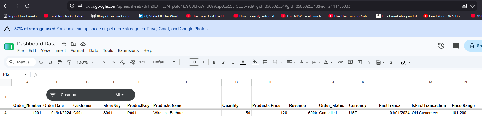
My dataset contains multiple rows. I will provide you with the header and the first row so you can clearly understand the data structure.
COPY AND PASTE OF DATASET (PLAIN TEXT)
Order_Number Order Date Customer StoreKey ProductKey Products Name Quantity Products Price Revenue Order_Status Currency FirstTransa IsFirstTransaction Price Range
1001 01/01/2024 C001 S001 P001 Wireless Earbuds 50 120 6000 Cancelled USD 01/01/2024 Old Customers 101-200
Prompt 2
STRICT RULES:
– Do NOT modify, replace, or change the data source under any circumstances.
Keep the existing data flow exactly as it is, including google.script.run…() and all related logic.
– Do not add new APIs, mock data, fetch/axios calls, or generate new data structures.
Only update UI/UX, layout, styling, and visualization based on the existing data.
All charts, KPI cards, and tables must strictly use the current data without altering its structure or origin.
All cards and charts on the main dashboard page must remain completely unchanged.
Do not modify, remove, or replace any existing components in the main view.
Create new sections for the following:
1. Orders Section
KPI summary cards
Line chart for trends
Data table for detailed orders
2. Products Section
KPI summary cards
Bar chart for product performance
Data table for product details
3. Customer Section
KPI summary cards
Pie chart for customer distribution/segmentation
Global Feature Requirement:
Implement a unified filter function that supports:
Day, Month, Year
This filter must work consistently across ALL charts and sections.
Chart Enhancement Requirement
Add meaningful annotations/labels to all charts to improve data interpretation and insights.




Comments are closed.