

📊 Retail Sales Analytics Dashboard Built with Python
I recently built a Retail Sales Analytics Dashboard using Python to automatically analyze sales data and generate visual insights.
The goal was simple:
Turn raw sales data into clear, actionable insights using a fully automated script.
The dashboard reads a CSV or Excel sales dataset and produces several key visualizations:
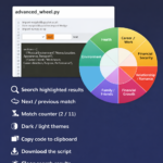
🔹 Sales Distribution Wheel
Shows the contribution of the top product categories to total sales, including percentages and rankings.
🔹 Top 10 Products by Sales
A ranked view of the best-selling products with their category and subcategory hierarchy.
🔹 Monthly Sales Trend
Tracks revenue performance over time to highlight seasonal patterns and demand changes.
🔹 Category Growth Rate
Identifies which product categories are growing the fastest.
🔹 Category Details Section
Provides a structured view of the category → subcategory hierarchy behind the numbers.
The script automatically calculates key metrics such as:
• Total sales
• Best performing category
• Best selling product
and displays them as KPI cards at the top of the dashboard.
The entire report can be exported as a high-resolution image or PDF, making it easy to share with stakeholders or include in reports.
🛠 Technologies Used
-
Python
-
Pandas (data analysis)
-
Matplotlib (visualization)
-
NumPy (numerical processing)
What I like about this approach is that it creates a lightweight analytics workflow:
Just drop in a new dataset and the dashboard updates automatically.
It’s a simple example of how Python can be used to build custom analytics tools similar to BI dashboards without relying on external platforms.
File path: “C:\PythonPrograms\advanced_wheel_of_life\advanced_sales_wheel_9.py”
advanced_sales_wheel_9.py → HTML viewer


Comments are closed.