

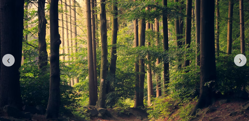
HTML Card Slider (4 Images)
Click the link to see the card slider in a new tab : card_slider.html


Images used:


 HTML Card Slider code [card_slider.html]
<!DOCTYPE html>
<html lang=”en”>
<head>
<meta charset=”UTF-8″>
<meta name=”viewport” content=”width=device-width, initial-scale=1.0″>
<title>Card Slider</title>
<style>
/* 1. Basic Reset & Layout */
* {
box-sizing: border-box;
margin: 0;
padding: 0;
font-family: sans-serif;
}
body {
display: flex;
justify-content: center;
align-items: center;
min-height: 100vh;
background-color: #f0f2f5;
}
/* 2. The Slider Container */
.slider-container {
position: relative;
width: 800px; /* Adjust width here */
height: 400px;
overflow: hidden; /* Hides the cards that slide out */
border-radius: 15px;
box-shadow: 0 10px 20px rgba(0,0,0,0.2);
}
/* 3. The Wrapper (holds the cards) */
.slider-wrapper {
display: flex;
width: 100%;
height: 100%;
transition: transform 0.5s ease-in-out; /* Smooth animation */
}
/* 4. Individual Cards */
.card {
min-width: 100%; /* Make card take full width of container */
height: 100%;
display: flex;
justify-content: center;
align-items: center;
background-color: #fff;
position: relative;
}
.card img {
width: 100%;
height: 100%;
object-fit: cover; /* Ensures image covers area without stretching */
}
/* 5. Navigation Buttons */
.nav-btn {
position: absolute;
top: 50%;
transform: translateY(-50%);
background-color: rgba(255, 255, 255, 0.7);
border: none;
width: 40px;
height: 40px;
border-radius: 50%;
cursor: pointer;
font-size: 20px;
color: #333;
z-index: 10;
transition: background 0.3s;
display: flex;
align-items: center;
justify-content: center;
}
.nav-btn:hover {
background-color: #333;
color: white;
}
.prev-btn { left: 10px; }
.next-btn { right: 10px; }
</style>
</head>
<body>
<div class=”slider-container”>
<!– Navigation Buttons –>
<button class=”nav-btn prev-btn”>❮</button>
<button class=”nav-btn next-btn”>❯</button>
<!– Cards Wrapper –>
<div class=”slider-wrapper” id=”sliderWrapper”>
<div class=”card”>
<img src=”https://images.unsplash.com/photo-1472214103451-9374bd1c798e?ixlib=rb-4.0.3&auto=format&fit=crop&w=800&q=80″ alt=”Mountain”>
</div>
<div class=”card”>
<img src=”https://images.unsplash.com/photo-1441974231531-c6227db76b6e?ixlib=rb-4.0.3&auto=format&fit=crop&w=800&q=80″ alt=”Nature”>
</div>
<div class=”card”>
<img src=”https://images.unsplash.com/photo-1493246507139-91e8fad9978e?ixlib=rb-4.0.3&auto=format&fit=crop&w=800&q=80″ alt=”Forest”>
</div>
<div class=”card”>
<img src=”https://images.unsplash.com/photo-1506744038136-46273834b3fb?ixlib=rb-4.0.3&auto=format&fit=crop&w=800&q=80″ alt=”Beach”>
</div>
</div>
</div>
<script>
// 1. Select Elements
const wrapper = document.getElementById(‘sliderWrapper’);
const prevBtn = document.querySelector(‘.prev-btn’);
const nextBtn = document.querySelector(‘.next-btn’);
const cards = document.querySelectorAll(‘.card’);
// 2. Set Initial State
let currentIndex = 0;
// Calculate total width of one card to use in transform
const cardWidth = cards[0].offsetWidth;
// 3. Function to Move Slider
function updateSlider() {
// Move wrapper by negative width of current index
wrapper.style.transform = `translateX(-${currentIndex * cardWidth}px)`;
}
// 4. Event Listeners
nextBtn.addEventListener(‘click’, () => {
// If at last card, go back to first (loop)
if (currentIndex >= cards.length – 1) {
currentIndex = 0;
} else {
currentIndex++;
}
updateSlider();
});
prevBtn.addEventListener(‘click’, () => {
// If at first card, go to last (loop)
if (currentIndex <= 0) {
currentIndex = cards.length – 1;
} else {
currentIndex–;
}
updateSlider();
});
// Handle window resize (optional: resets position on resize)
window.addEventListener(‘resize’, () => {
cardWidth = cards[0].offsetWidth;
updateSlider();
});
</script>
</body>
</html>
Views: 0


Comments are closed.